The Heer
General’s Collar Tab:
Exploring The
Variations
This page is the first step in a study of the variety in
hand-embroidered General officer and senior ranks collar tabs. This “project” goal is to
add some knowledge to the study of this insignia in hopes of verifying many of
the variations of Generals collar tabs that existed during the war. To accomplish this, my aim is to utilize
period photographs which clearly show these variations in actual wear. One of the bigger problems in this hobby
has been the attempt to assign “textbook” criteria to Third Reich
material, some of which is anything but textbook! Hand-embroidered insignia is one of
those examples. I often read
collector comments on forums or hear them at shows in which declarations are
made that the insignia in question “doesn’t display the quality
expected of General Officer insignia”, or “they never made it like
that”, or my personal favorite,
“it doesn’t look like MINE”!
The problem is, all of this was hand-made by what was
largely a cottage industry and there were variations in both quality and
material. Hand embroidery by its
very nature does not lend itself to creating exact duplicates as each piece
will display a degree of variation, unlike machine embroidery. It’s also difficult to have an
exact matched, left and right pair due to the difficulties of the hand creating
a reverse, mirror image. Add to this the reality that insignia were produced by
probably hundreds of firms, each with different materials to work with,
different talent levels of embroiderers, located throughout the Third Reich and
even in some of the foreign countries that were captured. So, in essence, how does one create
“textbook” in this type of environment? You don’t!
Now, one saving grace of all of this is that while there may
not be a textbook, there is definitely consistency in several areas, which help
us in our identification of what we believe to be period produced
insignia. These consistencies are
primarily in the execution of the embroidery and the materials used. Many try to fall back to the design of
the tab as being the only indicator of an original, but as you will see in the
imagery below, there was quite a degree of variation in design execution of Heer General collar insignia. We have to believe that some of this was
the intention of the embroidery firm to differentiate themselves from the
competition and show a different look or flair to their product to capture the
sale. In other cases it may have
just been the choice of the embroidering “artist” to add his or her
own definitive touch to express pride and individuality of their given
talent.
One also has to understand that there were likely larger
firms with bigger contracts who produced the bulk of what was available,
lending consistency to the look and appearance creating “common”
tab styles that are more often seen due to the volumes produced. These more
commonly seen pieces then become the “textbook” that the collector
community so loves to assign. The
rush to fulfill larger orders by these big firms may also explain why some
insignia is of lesser quality and doesn’t have the ornate detail one
might expect, as attention to individual detail and quality would not be as
attentive as that of a smaller firm not under the same pressure to produce
volume. Generals,
and officers could purchase higher quality, uniforms, caps and
insignia….for a higher price, if they wished and could afford it. Or they could buy their uniform items
through government procured outlets contracted at a lower price. So yes, some insignia was “not the
quality expected of a General officer” as some of it was not as good, or
as expensive. Insignia firms
competed for business like any other and some offered better quality at higher
prices.
So, as we’ve learned, there are a lot of reasons for
variation in this insignia. What
this page will focus on is variation in executed design, so that we might
better identify patterns that do not quite conform to expectation, yet are
valid original styles that were produced and worn during the war. Far too often original pieces are
questioned or dismissed because they don’t exhibit “accepted”
features that collector myth has
passed down as being the only indicators of originality. What’s
difficult to review on a website are the materials used for production and the
incredibly tight quality of hand-embroidery during the Third Reich….a
skill and trade that no longer exists.
We will discuss them, but in order to really learn about these factors the
collector needs to get out to militaria shows or meet
with other collectors who own original pieces so that they may be studied
in-hand and get a feel for the material and the workmanship. I know this
outreach may be difficult for some collectors, but I can tell you with all
certainty that you will never attain a
proficient level of identifying originals from fakes by solely looking at
pictures on the internet…you have to log some time studying the real
thing by hand. I cannot tell you how many times I have looked at pictures of
items and thought them fake, only to get the piece in hand and realize it was
original…and vice versa.
There are some incredibly well made copies, thanks to the high
availability of photos of originals on the internet, but the execution and
materials of the copies are usually given up once you have them in your hands
to examine.
We’ll begin with an overview of the collar tab
design. I’m going to use some
terminology that is largely of my own making so that the various traits of the
design elements and the variations can be pointed out in the period
photos. Please don’t take
this terminology as “textbook” as it is only being used for the
ease of discussion and in no way is already a part of collector lingo.
Basic Collar Tab Design
Elements
The collar tab design is based on a traditional arabesque
design pattern known as “Larisch” that
dates back to Prussian Infantry Regiment “Al-Larisch”
and the ornamented coats the officers wore during the late 18th
century. It has been used on
Prussian and German General Officer insignia since 1900.
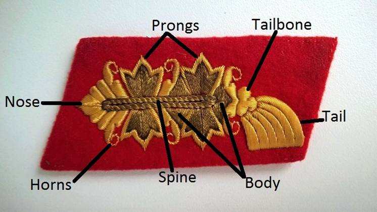
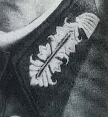
At the front, leading edge of the collar tab is the point or
NOSE of the tab. The
rear of the tab design is the TAIL, which also
resembles a brush, and is connected to the BODY of
the tab by a TAILBONE which
typically, but not always features three round edges which some refer to as
balls. The body is connected to the
nose by the SPINE which is an
elongated oval which is often closed, but sometimes open in the middle so that
you see the red backing. There are
two PRONGS that extend up and down from the spine (three prongs for
the rank of field marshal).
Sandwiching these prongs are HORNS which often are
very intricately curled and either curl back down inwards or can extend up and
above the prongs in curls or somewhat straighter patterns. These curls also have been seen to point
either right or left.
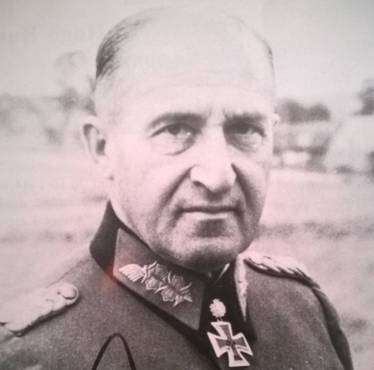
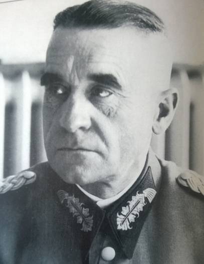
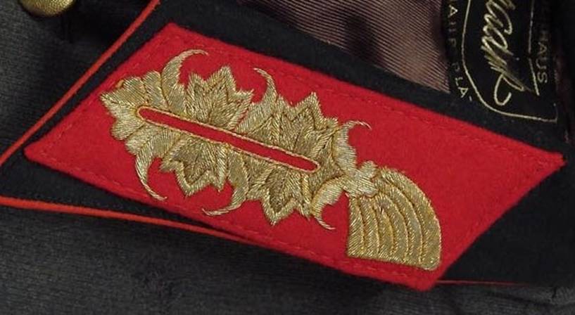
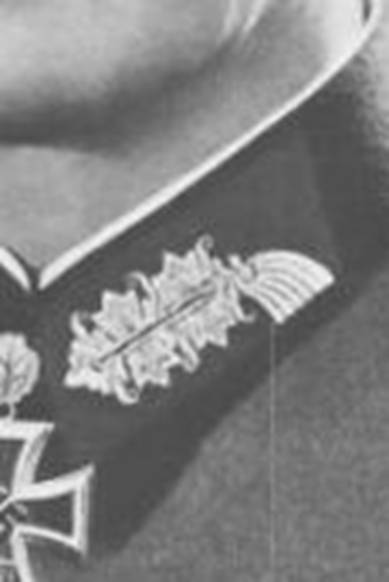
This particular tab is a good study in what is considered
“typical” design elements and execution for a Heer
General Officer collar tab. It is a
provenanced example having been obtained directly
from General Sachsenheimer by the late collector Bill
McClure, who was responsible for a great deal of the high end militaria purchased directly from Generals, Admirals, Field
Marshals and other senior ranking individuals all of which now resides in
collections worldwide. This
particular example is embroidered in both gold bullion wire and celleon (nylon) which provides the very distinct two-tone
colors and highlights. This is not
unusual, though not standard, to mix bullion and celleon,
most likely done to provide highlights and definition to the design. However most of what is encountered will
either be all-bullion or all-celleon. This is not true, however, for the
Luftwaffe (which will be explored in a separate page) as for reasons still
unknown the majority of Luft Generals insignia,
uniforms and headgear all seemed to feature a mixture of bullion and celleon as somewhat of a standard feature.
Understanding Variation
As mentioned earlier, the hobby is rife with those trying to
establish a standard textbook version of everything we encounter, but this
simply can’t be done with the vast majority of hand-embroidered senior
ranks insignia, for reasons already discussed. As a collector, this can be considered
exciting as if you are a collar tab collector as there are near endless
variations to acquire for your collection with each piece having the aesthetics
and quality of manufacture of a miniature piece of art! There is no reason to be afraid to
collect these things if you know what you are looking at and are familiar with
period workmanship and construction.
The period photos show us how varied these can be.
When the artisan was producing these pieces of insignia
he/she utilized a cardboard template referred to as an “unterlagen”, which was placed over the top of the red
backing cloth. From there, the
artisan began the embroidery and executed the process employing their own
individual touches or that of which was directed by the ownership of the
firm. While it is tempting to
assume there was one standard unterlagen authorized,
produced and distributed to all embroidery firms, the reality of what we see in
period pictures puts this in doubt.
Much of the variation we see is most likely from the individual hands
that did the embroidery, however we also see some distinct differences that
could’ve only been produced as a result of a variant in the unterlagen.
So, what are the variations we see? They range from subtle, to very
dramatic, but I will list below those most often seen and we’ll move on
to study photographic examples.
1. The “Spine” is either open in the middle of the
oval so that you can see the red backing cloth, or it can be completely closed.
2. The “Nose” can be very short and pug-like, or
longer and very pointy. The Field
Marshal tabs are a great example of this.
There can also be differing number of layers behind the point up to the
first Horn.
3. The “Tailbone” can be very intricately
constructed, providing the look of three spherical balls from which the tail
protrudes, or it can be very subtle curves looking more like a bird in flight.
4. The “Tail” can have quite a number of
variations, some with backing cloth protruding between the lines, others with
blurred lines. Typically the bottom
of the “brush” is a very straight, symmetrical line that is very defined, but in other cases it can be seen to be
wavy. The size and angle of the
brush can also vary somewhat dramatically.
5. The “Horns” show the most variation from tab to
tab, which is easily explained if you have ever seen the unterlagen. These horns and the degree to which they
curl depended entirely on artistic freedom and how much flair the individual
embroiderer decided to employ.
6. The “Prongs” are probably the most consistently
produced element of the tab, with variations mainly in the different wires and
threads used to fill in this area.
It’s also one of the easier areas to identify a fake as the
originals are very, very tightly embroidered together with typical symmetry
only a professional would employ. I
have seen differences in width and height of the prongs, but overall this area
is usually pretty consistent.
7. The “Body” is also somewhat consistent, with the
bulk of the variation being the area between the Nose and the Prong behind the
Nose.
Now that we have a basic understanding, let’s start
exploring some period photos so that we can see some of these variations and
consistencies first hand. After
that, we’ll explore some original examples out of contemporary
collections so that we can see nice, clear modern photos of some of these
variations.
|
|
|
|
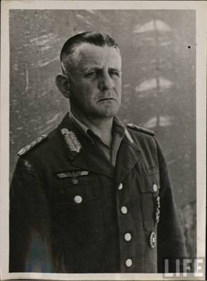
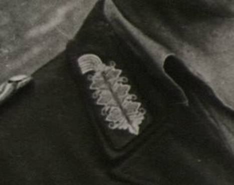
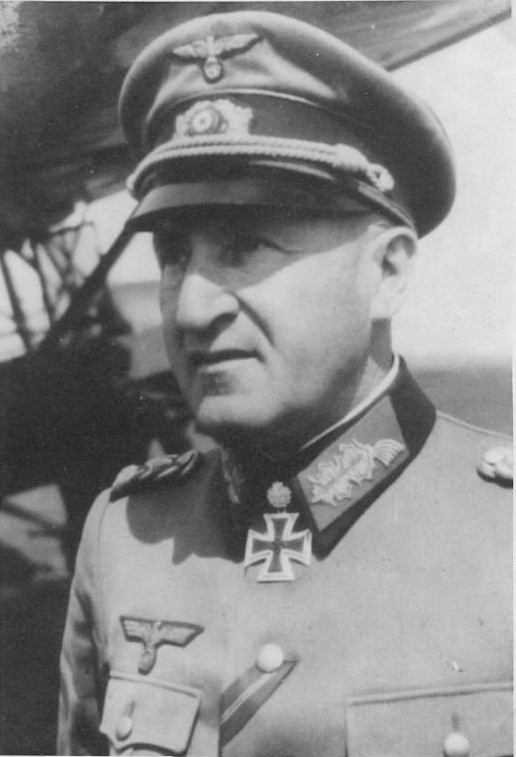
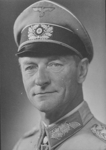
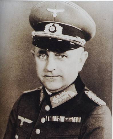
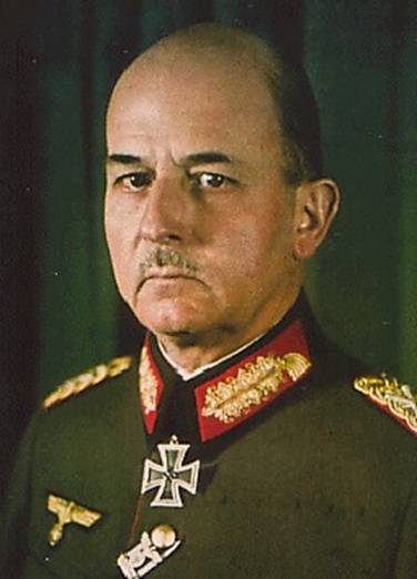
While this first example is not a variation, it IS a good example of how regulations were not always followed and that sometimes whatever was available was used. This is for the “they never did that” crowd. Here we have Generalmajor Heinrich Kreipe (on the cover of “LIFE” magazine, no less!) after his capture wearing collar tabs reserved for the rank of a Field Marshal! Obviously whoever tailored this particular uniform had no access to standard General officer collar tabs, yet somehow had field marshal tabs in the inventory and used those. While a situation like this certainly seems beyond speculation, as you would think there was not a regular inventory of such a rare and seldom used rank as field marshal insignia sitting in every tailor shop, here is an example. The Field Marshal collar tabs had a third “prong” to differentiate it from regular General officer tabs and the example here is the most commonly encountered example produced. |
|
|
|
|
|
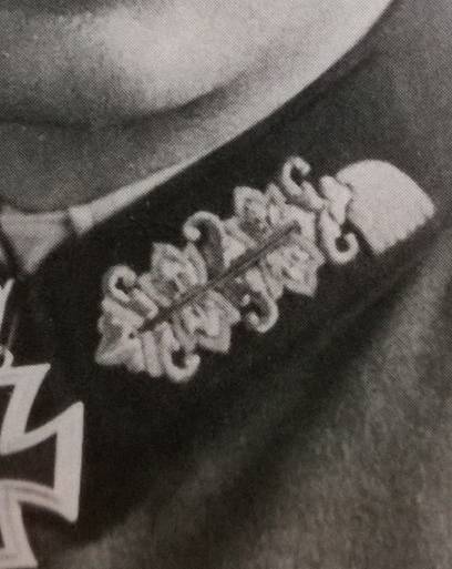
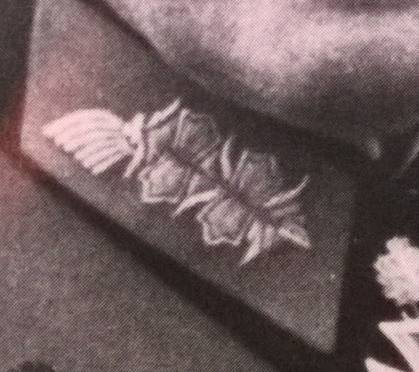
In this instance we have a fairly standard and common tab with some minor variations. Note how the tailbone is shaped more like a bird in flight with wings, rather than the three “balls” some collectors insist must be present. Also notice how the tail of the tab is not straight across the bottom but angled upwards a bit and the bottom of the brush is not even. The backing cloth is also visible between the arched lines in the tail. The prongs on this tab have just a slight curvature, but no curls. |
|
|
|
|
|
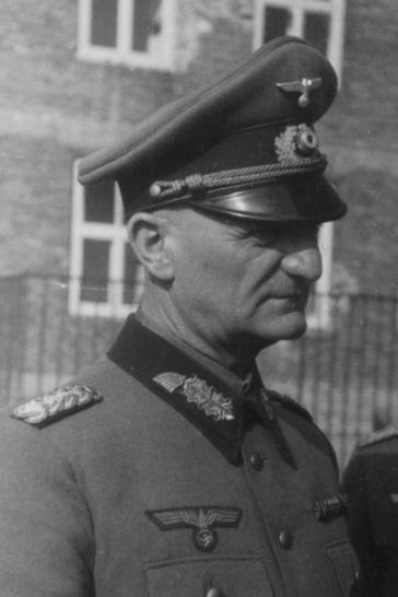
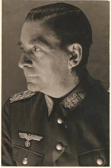
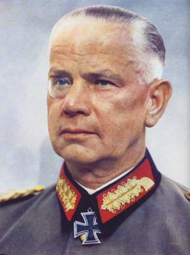
When viewing period photos that are “portrait” photos shot in a studio, always be careful of drawing too many conclusions regarding insignia as sometimes the photos are retouched, either to enhance the insignia (in this instance) or in many cases the insignia will be “upgraded” to reflect a promotion by adding pips, changing shoulderboards or even retouching new collar tabs on. In this particular example, the three dimensional nature of the look of the collar tabs indicate that they were most likely highlighted by some retouching, especially since you can see the four loops of General officer boards, so we know it wasn’t retouched from field grade rank. One other note; notice the shoulderboard on the right was put on backward as the button loop is facing the front and should be facing the back (this was a very common occurrence, but something else that collector myth has gotten wrong over the years). |
|
|
|
|
|
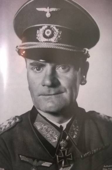
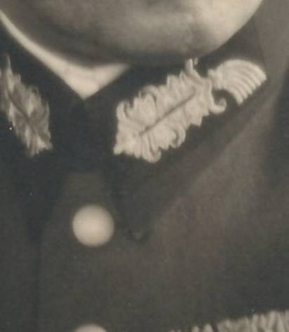
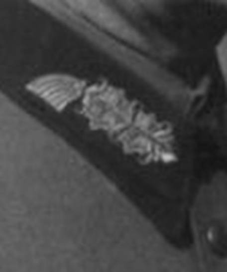
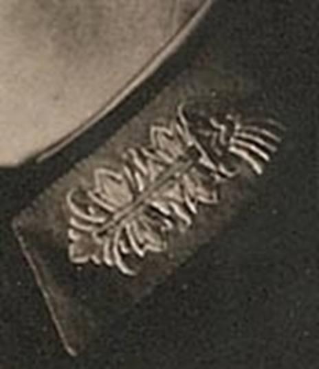
Here is an excellent example of a tab that varies quite dramatically and in hand would be declared a fake by most collectors examining it at a show. Notice how stubby the prongs are, the nose is misshapen and the bottom of the tail is not straight at all by very wavy and uneven. The bottom of the brush also extends below the tailbone and into the horn. Notice also how the two front horns are not symmetrical. This is Generaloberst Erhard Raus wearing this uniform. A grouping belonging to him was purchased directly from the family and included numerous pieces of insignia to include several sets of shoulderboards and three collar tabs, all of which displayed this unusual design in varying degrees (a couple examples are shown below). Without photographic evidence like this, examples such as these would be roundly dismissed by the collecting community. |
|
|
|
|
Two different examples, both for the wearers left collar,
of General officer rank tabs belonging to Generaloberst
Erhard Raus, which were obtained directly from his
family. Notice how the tail of
the tab is completely detached from the tailbone on the top tab. While similar, there are many differences
between both these tabs if you study them carefully. It’s quite possible these were
foreign made or possibly custom made by a tailor who didn’t have the
insignia in stock (which did happen as I’ve seen various examples). (private
collection) |
|
|
|
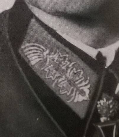
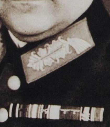
Another photo of Erhard Raus
wearing his rather unusual tabs. Note
the uneven symmetry along the bottom of the “brush” on the tail
of the tab, the odd nose and the crazy embroidery around the prongs toward
the rear of the tab. (private
collection) |
|
|
|
|
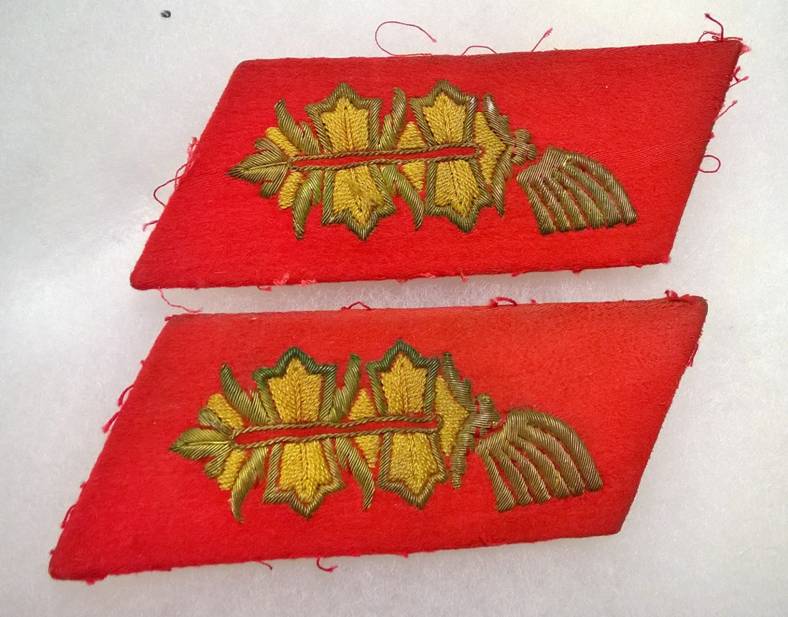
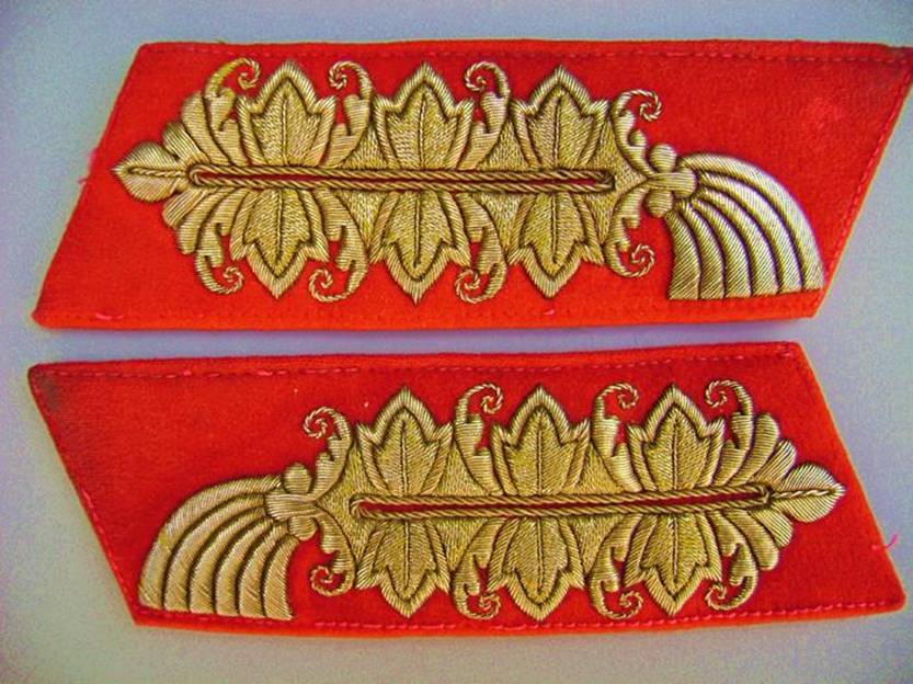
These are clearly celleon embroidered tabs (and shoulderboards) and are perfectly executed designs. Notice how symmetrical the oval inside of the spine is and how straight the bottom of the tail is. The only noticeable variation to the tabs are how much underlay is visible between the nose of the tab and the first prong. It also looks like the tailor may have removed the buckram backing before sewing these tabs on, which allows the tab to conform to the shape of the collar and also make it more comfortable for the wearer. |
|
|
|
|
|
In contrast to the previous tabs, these examples have a mostly closed spine. In this example, also notice how long and exaggerated the front and middle horns are and how far they dip down and above the prongs. The rear horns are much shorter but notice how the top one curves and points straight towards the back of the tab. I’ve seen a few versions of these none of which are the same, so either several different embroidery firms employed this design element or it was the same firm, but different individual embroiderers. Questions like this we’ll most likely never know. |
|
|
|
|
Here is an example of similar, though different design as
the tab featured in the period photo above, though not quite as ornate in
execution and with a tailbone lacking in detail, it also features the very exaggerated
front and middle horns. (private
collection) |
|
|
|
|
Notice how these tabs are somewhat compressed from side to side and very tall, in comparison to some of the other tabs we’ve examined. The embroidery is very “tall” top to bottom and has a very large tail, in comparison. The nose of this tab is very pointy, much like the field marshal examples. Notice how tall the center horn is at the top. One other common feature is how uneven the spine oval is. It is rarer to find a center spine oval that is perfectly symmetrical. |
|
|
|
|
|
Here’s an example of a very busy and crowded tab from an embroidery execution perspective. Every element from the nose to the tailbone is very busy and heavily embroidered. Notice how tall and fat the nose, first horns and prong are. Even the tail is very “fat”. |
|
|
|
|
|
Notice how high the top of the tail sits on this tab as well as how low the bottom or “brush” of the tail dips. |
|
|
|
|
|
Here is an nice example of a tab in which the tail and tailbone is completely detached from the body of the tab. |
|
|
|
|
|
In this example, notice how tall and distorted the prongs are, almost like they have been squished from left to right. Quite often reproductions and replicas have taller prongs. Note also how the bottom brush of the tail is at an upward slanted angle instead of a nice straight bottom edge. It’s also a very small tail in comparison to the size of the body. |
|
|
|
|
|
Notice that this General’s tabs have a tailbone that is well formed, but yet it sticks up above the tail rather than being centered into the base of it. One has to wonder how something like this happens when using a template (unterlagen) that is supposed to be consistent. |
|
Generalfeldmarschall
Collar Tabs
|
|
|
|
Unlike standard Generals tabs, Field Marshal tabs are known to be much more consistent in their design and execution, leading many collectors to mistakenly thinking there is only one “accepted” design. Since there were so few Field Marshals in comparison to Generals, it’s logical that a much smaller quantity of this insignia, and as a result fewer variations, were produced. Most likely one firm, perhaps in Berlin, produced the bulk of these particular examples. Above are pictures of Field Marshals wearing what is considered the typical, most commonly encountered tabs for this rank. I will refer to this style as Version A. The quickest method to identify these tabs are firstly by the very pointy protrusion on the nose of the tab, which resembles a spade, and secondly by the very curly, ornate horns that frame the prongs. |
|
|
|
|
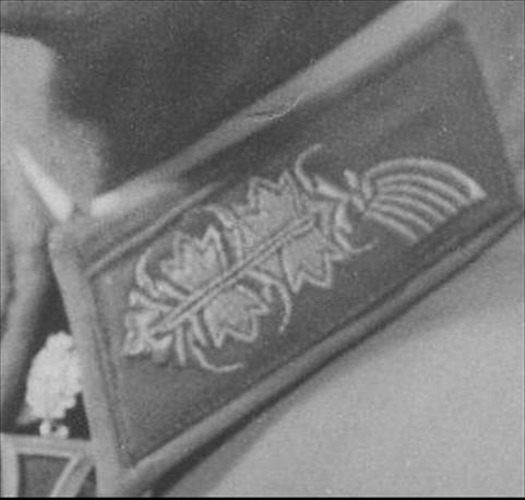
These collar tabs are attributed to Field Marshal Keitel
and are perfect examples of “Version
A”, the most commonly encountered collar insignia for this rank,
with the spade-like front nose and extremely curly and ornate horns framing
the three prongs. |
|
|
|
|
|
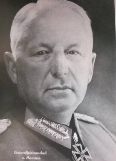
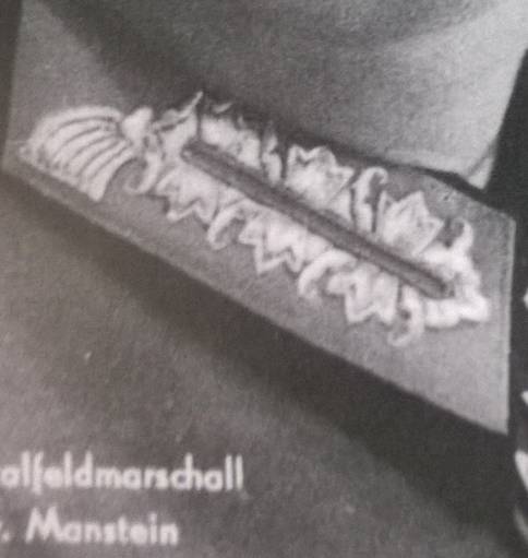
This is a variant Field Marshal tab, worn here by von Manstein, (who also wore the more commonly encountered tab). I will refer to this style as Version B. Notice how the nose of the tab doesn’t have the spade and the nose is more compressed. The horns, while still rather curly aren’t quite as exaggerated as the Version A examples. The third variation to this B style tab is the backbone does not have the three well-formed and pronounced balls and instead is somewhat bird shaped. |
||
|
|
|
|
|
Here’s a nice example of the Version B variant tab
showing the three different variations described above. It is from one of the tunics belonging
to Field Marshal von Bock. |
|
|
|
|
|
This tab that Field Marshal Erwin Rommel is wearing is
distinctly different than the other tabs explored above, and is the third
variation we’re looking at, which I call Version C. Notice how
short and stubby the nose of the tab is and how it almost looks like a
flower. Now look at the tail and
notice how pronounced the brush is and how the underlay shows between the
embroidery. Also take note of the tailbone and how it also resembles a
flower, rather than the “balls” or “bird-like”
pattern of other tabs. |
|
|
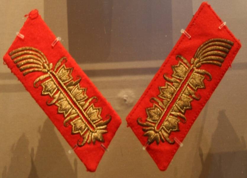
|
Here are the exact same tabs, which are displayed in the
Imperial War Museum in London.
They were given as a gift to British Field Marshal Bernard Montgomery,
along with one of Rommel’s shoulderboards. |
There are a
few other variations of Field Marshal tabs that I’ve
encountered, most of which I suspect are manufacturers samples that were either
produced in hopes of obtaining a contract, or were never sold or distributed.
Until they can be identified in a period photo, they will remain as examples period
produced, but never utilized. In
the future I will be expanding this section on a regular basis to add any new
information that is discovered.
Also, if
you haven’t been there already, please visit the Heer General
collar tabs page which features examples for study that are
from collections and museums.
I’m looking for good period photographs of original
Heer General’s and Field Marshal collar tab variations.
If you have something to contribute, please visit the submitting
photos page.